Plotting via Graph Objects
While Plotly Express is excellent for quick data exploration, it has some limitations:
- fewer plot types
- does not allow combining different plot types directly in a single figure
- limited customization
Plotly Graph Objects, on the other hand, is a lower-level library that offers greater functionality and customization with layouts. In this section, we’ll explore Graph Objects, starting with 2D plots.
Graph Objects supports many plot types:
import plotly.graph_objs as go
dir(go)
?go.Figure   # see input data types
bar, barpolar, box, candlestick, carpet, choropleth, choroplethmap,
choroplethmapbox, cone, contour, contourcarpet, densitymap, densitymapbox,
funnel, funnelarea, heatmap, histogram, histogram2d, histogram2dcontour,
icicle, image, indicator, isosurface, mesh3d, ohlc, parcats, parcoords,
pie, sankey, scatter, scatter3d, scattercarpet, scattergeo, scattergl,
scattermap, scattermapbox, scatterpolar, scatterpolargl, scattersmith,
scatterternary, splom, streamtube, sunburst, surface, table, treemap, violin,
volume, waterfallScatter plots
At the very beginning of this workshop we saw an example of a Scatter plot with Graph Objects:
import plotly.graph_objs as go
from numpy import linspace, sin
x = linspace(0.01,1,100)
y = sin(1/x)
line = go.Scatter(x=x, y=y, mode='lines+markers', name='sin(1/x)')
go.Figure([line])
Let’s print the dataset line:
type(line)    # plotly.graph_objs._scatter.Scatter
print(line)   # it's a dictionary!
line['name']   # returns a string
line['x']      # returns a numpy array
It is a plotly object which is actually a Python dictionary underneath, with all elements clearly identified (plot type, x NumPy array, y NumPy array, line type, legend line name). So, go.Scatter simply creates a dictionary with the corresponding type element. Right now, this variable line completely describes our plot! To create a plot in Graph Objects, we pass a list of such objects to a plotting function.
In Plotly, these objects are called traces, and they are a fundamental building block of a plot.
Hovering over each data point will reveal their coordinates. Use the toolbar at the top. When zooming in/out, double-clicking on the plot will reset it.
Pass a list of two traces to the plotting routine with data = [line1,line2]. Let the second trace line2 contain another mathematical function. The idea is to have multiple objects in the plot.
Add a bunch of dots to the plot with dots = go.Scatter(x=[.2,.4,.6,.8], y=[2,1.5,2,1.2]). What is default scatter mode?
Change line colour and width by adding the dictionary line=dict(color=('rgb(10,205,24)'),width=4) to dots. Make the colour yellow – there are two ways to do this: via RGB and by passing a string. Now make the line markers green.
Create a scatter plot of 300 random filled blue circles inside a unit square. Their random opacity must anti-correlate with their size (bigger circles should be more transparent) – see the plot below. 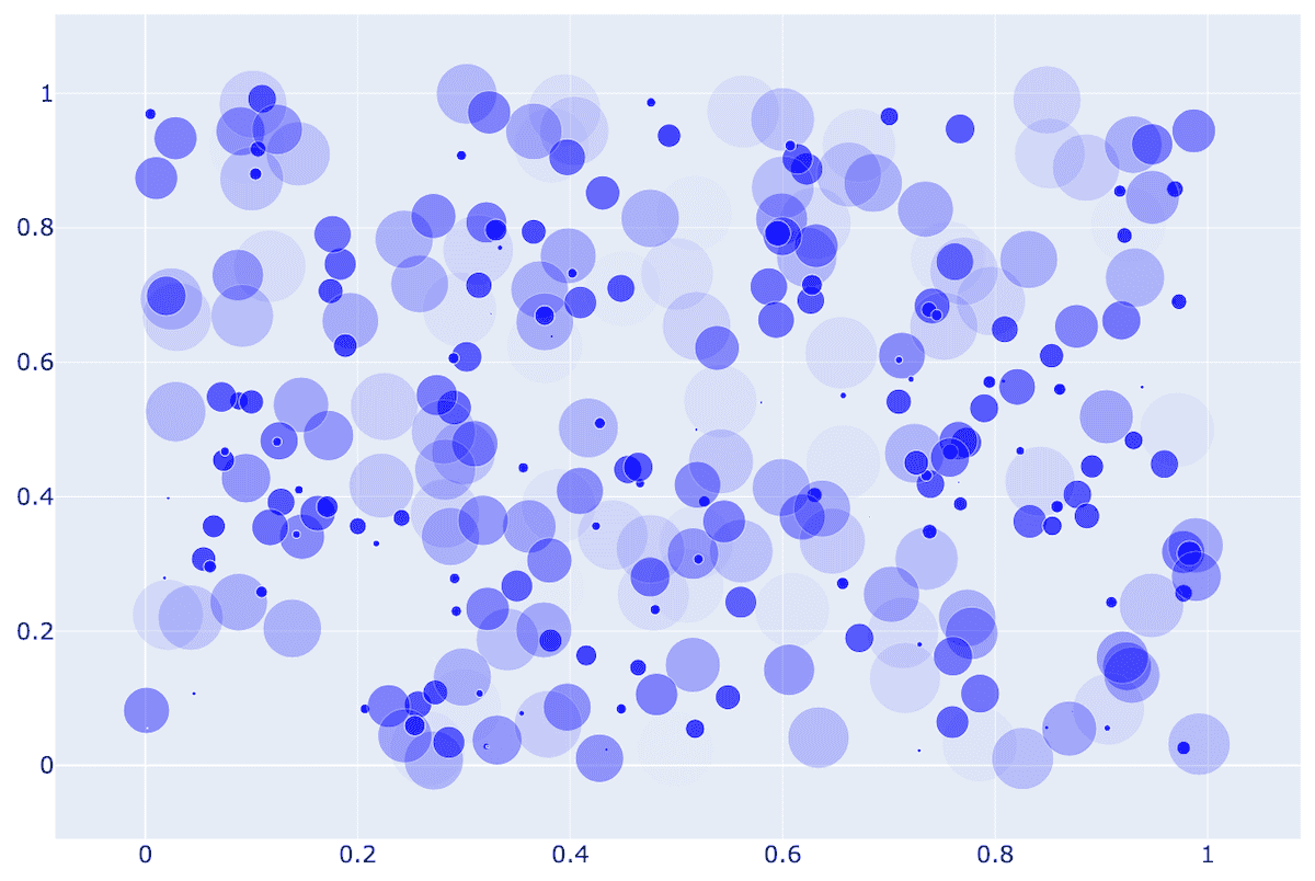
For more precise customization, try updating a layout after creating the figure:
fig = go.Figure(...)
fig.update_layout(xaxis=dict(tickfont=dict(size=24), range=[0, 1]),
                  yaxis=dict(tickfont=dict(size=24), range=[0, 1]))
fig.show()You can use fig.update_layout with both Graph Objects and Plotly Express, as both create the same type of object.
Bar plots
Let’s try a Bar plot, constructing data directly in one line from the dictionary:
import plotly.graph_objs as go
bar = go.Bar(x=['Vancouver', 'Calgary', 'Toronto', 'Montreal', 'Halifax'],
               y=[2463431, 1392609, 5928040, 4098927, 403131])
go.Figure(data=[bar])
Let’s plot inner city population vs. greater metro area for each city:
import plotly.graph_objs as go
cities = ['Vancouver', 'Calgary', 'Toronto', 'Montreal', 'Halifax']
proper = [662_248, 1_306_784, 2_794_356, 1_762_949, 439_819]
metro = [3_108_926, 1_688_000, 6_491_000, 4_615_154, 530_167]
bar1 = go.Bar(x=cities, y=proper, name='inner city')
bar2 = go.Bar(x=cities, y=metro, name='greater area')
go.Figure(data=[bar1,bar2])
Let’s now do a stacked plot, with outer city population on top of inner city population:
outside = [m-p for p,m in zip(proper,metro)]   # need to subtract
bar1 = go.Bar(x=cities, y=proper, name='inner city')
bar2 = go.Bar(x=cities, y=outside, name='outer city')
go.Figure(data=[bar1,bar2], layout=go.Layout(barmode='stack'))   # new element!
What else can we modify in the layout?
help(go.Layout)There are many attributes!
Heatmaps
- go.Area() for plotting wind rose charts
- go.Box() for basic box plots
Let’s plot a heatmap of monthly temperatures at the South Pole:
import plotly.graph_objs as go
months = ['Jan', 'Feb', 'Mar', 'Apr', 'May', 'Jun', 'Jul', 'Aug', 'Sep', 'Oct', 'Nov', 'Dec', 'Year']
recordHigh = [-14.4,-20.6,-26.7,-27.8,-25.1,-28.8,-33.9,-32.8,-29.3,-25.1,-18.9,-12.3,-12.3]
averageHigh = [-26.0,-37.9,-49.6,-53.0,-53.6,-54.5,-55.2,-54.9,-54.4,-48.4,-36.2,-26.3,-45.8]
dailyMean = [-28.4,-40.9,-53.7,-57.8,-58.0,-58.9,-59.8,-59.7,-59.1,-51.6,-38.2,-28.0,-49.5]
averageLow = [-29.6,-43.1,-56.8,-60.9,-61.5,-62.8,-63.4,-63.2,-61.7,-54.3,-40.1,-29.1,-52.2]
recordLow = [-41.1,-58.9,-71.1,-75.0,-78.3,-82.8,-80.6,-79.3,-79.4,-72.0,-55.0,-41.1,-82.8]
data = [recordHigh, averageHigh, dailyMean, averageLow, recordLow]
yticks = ['record high', 'aver.high', 'daily mean', 'aver.low', 'record low']
heatmap = go.Heatmap(z=data, x=months, y=yticks)
go.Figure([heatmap])
With heatmaps, very often people plot NumPy arrays. The function go.Heatmap is happy to take a 2D NumPy array: change z=data to z=np.array(data) to verify this.
Add an argument to go.Heatmap to try a few different colourmaps, e.g. ‘Viridis’, ‘Jet’, ‘Rainbow’. What colourmaps are available?
Contour maps
Pretend that our heatmap is defined over a 2D domain and plot the same temperature data as a contour map. Remove the Year data (last column) and use go.Contour to plot the 2D contour map.
Geographical scatterplot
In our next plot, we will read data from a file. Let’s copy a few data files into our home directory. Open a terminal window inside Jupyter (+ | Terminal) and run this command:
unzip /project/def-sponsor00/shared/paraview.zip \
      data/{cities,gdp,mt_bruno_elevation,legatum2015}.csv
Next, switch back to your Python notebook. Let’s do a scatterplot on top of a geographical map:
import plotly.graph_objs as go
import pandas as pd
from math import log10
df = pd.read_csv('data/cities.csv')   # lists name,pop,lat,lon for 254 Canadian cities and towns
df['text'] = df['name'] + '<br>Population ' + \
             (df['pop']/1e6).astype(str) +' million' # add new column for mouse-over

largest, smallest = df['pop'].max(), df['pop'].min()
def normalize(x):
    return log10(x/smallest)/log10(largest/smallest)   # x scaled into [0,1]

df['logsize'] = round(df['pop'].apply(normalize)*255)   # new column
cities = go.Scattergeo(
    lon = df['lon'], lat = df['lat'], text = df['text'],
    marker = dict(
        size = df['pop']/5000,
        color = df['logsize'],
        colorscale = 'Viridis',
        showscale = True,   # show the colourbar
        line = dict(width=0.5, color='rgb(40,40,40)'),
        sizemode = 'area'))
layout = go.Layout(title = 'City populations',
                   width=800, showlegend = False,
                   geo = dict(scope = 'north america',
                              resolution = 50,   # base layer resolution of km/mm
                              lonaxis = dict(range=[-130,-55]), lataxis = dict(range=[44,70]), # plot range
                              showland = True, landcolor = 'rgb(217,217,217)',
                              showrivers = True, rivercolor = 'rgb(153,204,255)',
                              showlakes = True, lakecolor = 'rgb(153,204,255)',
                              subunitwidth = 1, subunitcolor = "rgb(255,255,255)",   # province border
                              countrywidth = 2, countrycolor = "rgb(255,255,255)"))  # country border
go.Figure(data=[cities], layout=layout)Modify the code to display only 10 largest cities.
Recall how we combined several scatter plots in one figure before. You can combine several plots on top of a single map – let’s combine scattergeo + choropleth:
import plotly.graph_objs as go
import pandas as pd
df = pd.read_csv('data/cities.csv')
df['text'] = df['name'] + '<br>Population ' + \
             (df['pop']/1e6).astype(str)+' million' # add new column for mouse-over
cities = go.Scattergeo(lon = df['lon'],
                       lat = df['lat'],
                       text = df['text'],
                       marker = dict(
                           size = df['pop']/5000,
                           color = "lightblue",
                           line = dict(width=0.5, color='rgb(40,40,40)'),
                           sizemode = 'area'))
gdp = pd.read_csv('data/gdp.csv')   # read name, gdp, code for 222 countries
c1 = [0,"rgb(5, 10, 172)"]     # define colourbar from top (0) to bottom (1)
c2, c3 = [0.35,"rgb(40, 60, 190)"], [0.5,"rgb(70, 100, 245)"]
c4, c5 = [0.6,"rgb(90, 120, 245)"], [0.7,"rgb(106, 137, 247)"]
c6 = [1,"rgb(220, 220, 220)"]
countries = go.Choropleth(locations = gdp['CODE'],
                          z = gdp['GDP (BILLIONS)'],
                          text = gdp['COUNTRY'],
                          colorscale = [c1,c2,c3,c4,c5,c6],
                          autocolorscale = False,
                          reversescale = True,
                          marker = dict(line = dict(color='rgb(180,180,180)',width = 0.5)),
                          zmin = 0,
                          colorbar = dict(tickprefix = '$',title = 'GDP<br>Billions US$'))
layout = go.Layout(hovermode = "x", showlegend = False)  # do not show legend for first plot
go.Figure(data=[cities,countries], layout=layout)
3D topographic elevation
Let’s plot some tabulated topographic elevation data:
import plotly.graph_objs as go
import pandas as pd
table = pd.read_csv('data/mt_bruno_elevation.csv')
surface = go.Surface(z=table.values)  # use 2D numpy array format
layout = go.Layout(title='Mt Bruno Elevation',
                   width=1200, height=1200,    # image size
                   margin=dict(l=65, r=10, b=65, t=90))   # margins around the plot
go.Figure([surface], layout=layout)
You can rotate this plot in 3D!
3D plot of a 2D function \(f(x,y)\)
Next, let’s plot a 2D function \(f(x,y) = (1−y)\sin(\pi x) + y\sin^2(2\pi x)\), where \(x,y\in [0,1]\) on a \(100^2\) grid, using colorscale='Viridis':
import plotly.graph_objs as go
from numpy import *
n = 100   # plot resolution
x = linspace(0,1,n)
y = linspace(0,1,n).reshape(n,1)
F = (1-y)*sin(pi*x) + y*(sin(2*pi*x))**2   # array operation
data = go.Surface(z=F, colorscale='Viridis')
layout = go.Layout(width=1000, height=1000)
go.Figure(data=[data], layout=layout)
Lighting controls
Let’s change the default light in the room by adding lighting=dict(ambient=0.1) inside go.Surface(). Now our plot is much darker!
ambientcontrols the light in the room (default = 0.8)roughnesscontrols amount of light scattered (default = 0.5)diffusecontrols the reflection angle width (default = 0.8)fresnelcontrols light washout (default = 0.2)specularinduces bright spots (default = 0.05)
Let’s try lighting=dict(ambient=0.1,specular=0.3) – now there is a lot of reflected light!
3D parametric plots
In plotly documentation you can find quite a lot of different 3D plot types. Here is something visually very different, but it still uses go.Surface(x,y,z):
import plotly.graph_objs as go
from numpy import pi, sin, cos, mgrid
dphi, dtheta = pi/250, pi/250    # 0.72 degrees
[phi, theta] = mgrid[0:pi+dphi*1.5:dphi, 0:2*pi+dtheta*1.5:dtheta]
        # define two 2D grids: both phi and theta are (252,502) numpy arrays
r = sin(4*phi)**3 + cos(2*phi)**3 + sin(6*theta)**2 + cos(6*theta)**4
x = r*sin(phi)*cos(theta)   # x is also (252,502)
y = r*cos(phi)              # y is also (252,502)
z = r*sin(phi)*sin(theta)   # z is also (252,502)
surface = go.Surface(x=x, y=y, z=z, colorscale='Viridis')
layout = go.Layout(title='parametric plot')
go.Figure(data=[surface], layout=layout)
3D scatter plots
Let’s take a look at a 3D scatter plot using the country index data from http://www.prosperity.com for 142 countries:
import plotly.graph_objs as go
import pandas as pd
df = pd.read_csv('data/legatum2015.csv')
spheres = go.Scatter3d(x=df.economy,
                       y=df.entrepreneurshipOpportunity,
                       z=df.governance,
                       text=df.country,
                       mode='markers',
                       marker=dict(sizemode = 'diameter',
                                   sizeref = 0.3,   # max(safetySecurity+5.5) / 32
                                   size = df.safetySecurity+5.5,
                                   color = df.education,
                                   colorscale = 'Viridis',
                                   colorbar = dict(title = 'Education'),
                                   line = dict(color='rgb(140, 140, 170)')))   # sphere edge
layout = go.Layout(height=900, width=900,
                   title='Each sphere is a country sized by safetySecurity',
                   scene = dict(xaxis=dict(title='economy'),
                                yaxis=dict(title='entrepreneurshipOpportunity'),
                                zaxis=dict(title='governance')))
go.Figure(data=[spheres], layout=layout)
3D graphs
We can plot 3D graphs. Consider a Dorogovtsev-Goltsev-Mendes graph: in each subsequent generation, every edge from the previous generation yields a new node, and the new graph can be made by connecting together three previous-generation graphs.
import plotly.graph_objs as go
import networkx as nx
import sys
generation = 5
H = nx.dorogovtsev_goltsev_mendes_graph(generation)
print(H.number_of_nodes(), 'nodes and', H.number_of_edges(), 'edges')
pos = nx.spectral_layout(H,scale=1,dim=3)
Xn = [pos[i][0] for i in pos]   # x-coordinates of all nodes
Yn = [pos[i][1] for i in pos]   # y-coordinates of all nodes
Zn = [pos[i][2] for i in pos]   # z-coordinates of all nodes
Xe, Ye, Ze = [], [], []
for edge in H.edges():
    Xe += [pos[edge[0]][0], pos[edge[1]][0], None]   # x-coordinates of all edge ends
    Ye += [pos[edge[0]][1], pos[edge[1]][1], None]   # y-coordinates of all edge ends
    Ze += [pos[edge[0]][2], pos[edge[1]][2], None]   # z-coordinates of all edge ends

degree = [deg[1] for deg in H.degree()]   # list of degrees of all nodes
labels = [str(i) for i in range(H.number_of_nodes())]
edges = go.Scatter3d(x=Xe, y=Ye, z=Ze,
                     mode='lines',
                     marker=dict(size=12,line=dict(color='rgba(217, 217, 217, 0.14)',width=0.5)),
                     hoverinfo='none')
nodes = go.Scatter3d(x=Xn, y=Yn, z=Zn,
                     mode='markers',
                     marker=dict(sizemode = 'area',
                                 sizeref = 0.01, size=degree,
                                 color=degree, colorscale='Viridis',
                                 line=dict(color='rgb(50,50,50)', width=0.5)),
                     text=labels, hoverinfo='text')

axis = dict(showline=False, zeroline=False, showgrid=False, showticklabels=False, title='')
layout = go.Layout(
    title = str(generation) + "-generation Dorogovtsev-Goltsev-Mendes graph",
    width=1000, height=1000,
    showlegend=False,
    scene=dict(xaxis=go.layout.scene.XAxis(axis),
               yaxis=go.layout.scene.YAxis(axis),
               zaxis=go.layout.scene.ZAxis(axis)),
    margin=go.layout.Margin(t=100))
go.Figure(data=[edges,nodes], layout=layout)
3D function \(f(x,y,z)\)
Let’s create an isosurface of a decoCube function at f=0.03. Isosurfaces are returned as a list of polygons, and for plotting polygons in plotly we need to use plotly.figure_factory.create_trisurf() which replaces plotly.graph_objs.Figure():
from plotly import figure_factory as FF
from numpy import mgrid
from skimage import measure
X,Y,Z = mgrid[-1.2:1.2:30j, -1.2:1.2:30j, -1.2:1.2:30j] # three 30^3 grids, each side [-1.2,1.2] in 30 steps
F = ((X*X+Y*Y-0.64)**2 + (Z*Z-1)**2) * \
    ((Y*Y+Z*Z-0.64)**2 + (X*X-1)**2) * \
    ((Z*Z+X*X-0.64)**2 + (Y*Y-1)**2)
vertices, triangles, normals, values = measure.marching_cubes(F, 0.03)  # create an isosurface
x,y,z = zip(*vertices)   # zip(*...) is opposite of zip(...): unzips a list of tuples
FF.create_trisurf(x=x, y=y, z=z, plot_edges=False,
                  simplices=triangles, title="Isosurface", height=800, width=800)
Try switching plot_edges=False to plot_edges=True – you’ll see individual polygons!
Animation
There is quite a bit to say about creating animations with Graph Objects, but we can’t really cover it in this workshop. Perhaps, we could offer a webinar on this topic in the future?