Plotly Express (data exploration) library
In Plotly Express you can create a plot with a single function call.
- Multiple traces: if you want to overlay let’s say a scatter plot, a bar chart, and a trend line that all use different data sources. GO makes this much cleaner!
- Fine-tuned markers: you need deeper access to marker properties, e.g. the line border of a circle, opacity, custom hover data or format.
- Performance: for extremely large datasets,
go.Scattergl(the WebGL version ofgo.Scatter) provides significantly better performance than standard scatter plots.
Let’s create a simple line plot in Plotly Express, using data from NumPy arrays:
import plotly.express as px
from numpy import linspace, sin
x = linspace(0.01,1,100)
y = sin(1/x)
px.line(x=x, y=y, markers=True, title = "My chart title")
Alternatively, you can provide a DataFrame as input:
import plotly.express as px
from numpy import linspace, sin
import pandas as pd
x = linspace(0.01,1,100)
df = pd.DataFrame({'col1': x, 'col2': sin(1/x)})
px.line(df, x='col1', y='col2', markers=True)px.chart_type(
data_frame = df, # your Pandas DataFrame
x = "column_A", # column for x-axis
y = "column_B", # column for y-axis
color = "column_C", # color-code by this column
title = "My plot title" # label your work
)Or you can provide a dictionary:
import plotly.express as px
from numpy import linspace, sin
x = linspace(0.01,1,100)
d = {'key1': x, 'key2': sin(1/x)}
px.line(d, x='key1', y='key2', markers=True)
Try markers=False to hide the points.
Customizing the Look & Feel
Note that in px.line there is no built-in argument to change the marker style, or hide the line, or assign a specific colour, or do many other customizations. All of these things are easy to do once you notice that px.line returns a Graph Objects figure:
import plotly.express as px
from numpy import linspace, sin
x = linspace(0.01,1,100)
y = sin(1/x)
fig = px.line(x=x, y=y, markers=True, title = "My chart title")
print(type(fig))
so you can use Graph Objects’s standard controls to modify your Plotly Express figure. Let’s try some of these:
fig.update_traces(marker=dict(size=10, color='red'),
                  line=dict(width=5, color='orange')
)
fig.update_layout(
    title_font_size=24,
    template="plotly_dark"   # try 'ggplot2', 'seaborn', 'none'
)
fig.show()
Tips data
To see Plotly Express really shine, we should play with a slightly larger dataset containing several variables. The module px.data comes with several datasets included. Let’s take a dataset describing restaurant tips from 244 transactions and build a histogram:
import plotly.express as px
df = px.data.tips()
df
px.histogram(df, x="total_bill")Let’s colour these transactions by the day of the week:
px.histogram(df, x="total_bill", color="day")Let’s build a scatter plot:
px.scatter(df, x="total_bill", y="tip", color="time", size="size")Gapminder data
Let’s take a look at the Gapminder 2007 dataset that contains one row per each country:
import plotly.express as px
df = px.data.gapminder().query("year==2007")
df.shape   # 142 rows and 8 columns
df
px.scatter(df, x="gdpPercap", y="lifeExp") # this should be familiarTry hovering over individual data points. Which data fields do you see?
- add
log_x=True - add
hover_name="country"to title each hover - add
hover_data=["country", "continent"]to display fields in hover - add
size="pop" - add
size_max=60 - add
color="continent"- can now turn continents off/on
Let’s try a single-axis scatter plot:
px.strip(df, x="lifeExp")- add
hover_name="country" - add
color="continent"- now a separate plot for each continent - change strip to histogram
- can turn continents off/on in the legend
- add
marginal="rug"to show countries in a rug plot - add
y="pop"to switch from country count to population along the vertical axis - add
facet_col="continent"to break continents into facet columns
Let’s check several other plot types:
px.bar(df, color="lifeExp", x="pop", y="continent", hover_name="country")

px.sunburst(df, color="lifeExp", values="pop", path=["continent", "country"],
            hover_name="country", height=800)

px.treemap(df, color="lifeExp", values="pop", path=["continent", "country"],
           hover_name="country", height=500)

px.choropleth(df, color="lifeExp", locations="iso_alpha", hover_name="country", height=580)
Montreal’s elections data
A ternary plot shows compositions of three components that sum to a constant (usually 1 or 100%). Here is an ternary plot example with Montreal’s 2013 municipal elections data covering 58 electoral districts and 3 candidates:
df = px.data.election()
px.scatter_ternary(df, a="Joly", b="Coderre", c="Bergeron", color="winner",
                   size="total", hover_name="district", size_max=15,
                   color_discrete_map={"Joly": "blue", "Bergeron": "green", "Coderre": "red"})
Animation
In Plotly Express, with a dataframe input, you can animate in one of the columns. There are two additional flags to pass to a plotting function:
- values from
animation_framecolumn are used to assign marks to animation frames- adds a play button
- rows with matching
animation_groupvalues will be treated as if they describe the same object in each frame
In other words, with animation_group="country", each country will correspond to one moving object in the animation.
import plotly.express as px
df = px.data.gapminder()
px.scatter(df, x="gdpPercap", y="lifeExp", animation_frame="year", animation_group="country",
           size="pop", color="continent", hover_name="country",
           log_x=True, size_max=55, range_x=[200,80000], range_y=[25,90])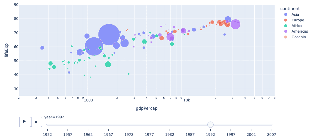
Here it is important to set range_x and range_y to ensure that all objects are shown in every frame. Without these, the axis ranges are determined by the first frame and remain fixed throughout the animation.
Try saving this interactive animation as an HTML5 file — it works and is completely self-contained, rendering in a browser without a backend server.
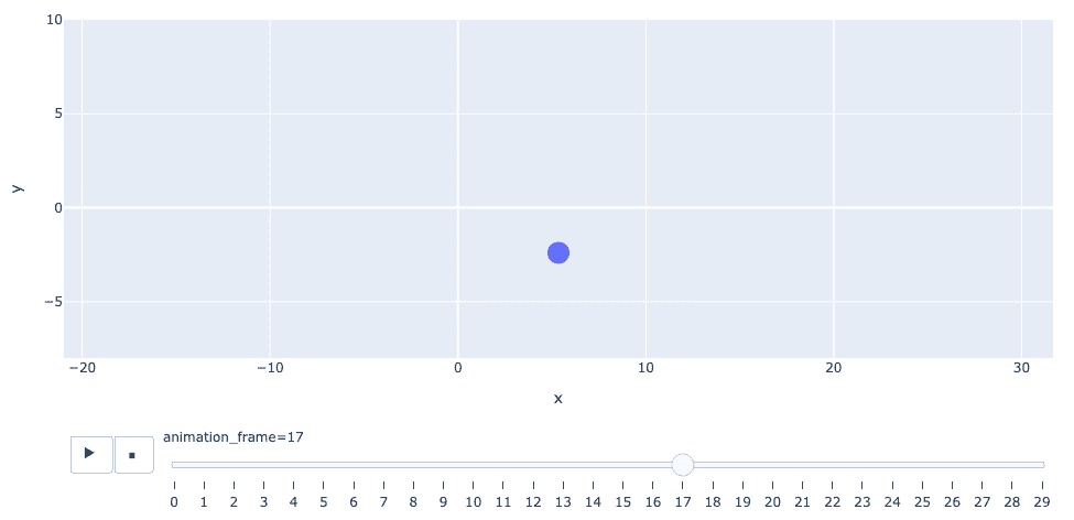
Next, let try to build data to be used for animation from scratch. Here is a simple spiral with 30 points:
import plotly.express as px
import numpy as np

npoints = 30
t = np.linspace(0,10,npoints)
x, y = t*np.cos(t), t*np.sin(t)

fig = px.line(x=x, y=y, markers=True)
fig.update_yaxes(range=[-8, 10], scaleanchor="x", scaleratio=1)
fig.update_traces(marker=dict(size=20))
Add animation_frame=range(npoints)) to px.line, and now you can play it back! Plotly will notice that in the line
fig = px.line(x=x, y=y, markers=True, animation_frame=range(npoints))x, y and animation_frame all have the same length, so it will treat the subsequent elements of x and y arrays as a “running” pair of x,y-coordinates for individual frames.
What if you want to have multiple objects per frame, e.g. two dots on two spirals, respectively?
- One option would to use Graph Objects where you can plot two spirals at the same time.
- Another option is to format your data as a dataframe:
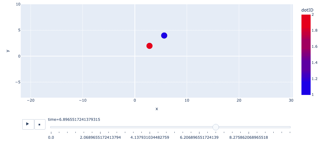
import pandas as pd
import numpy as np
import plotly.express as px

nframes = 30
t = np.linspace(0, 10, nframes)
x1, y1 = t*np.cos(t), t*np.sin(t)
x2, y2 = t/2*np.cos(t), t/2*np.sin(t)
df = pd.DataFrame({
    "time": np.concatenate([t, t]),   # merge two time arrays
    "x": np.concatenate([x1, x2]),
    "y": np.concatenate([y1, y2]),
    "dotID": np.concatenate([[1]*nframes, [2]*nframes])
})

fig = px.scatter(df, x="x", y="y",
                 animation_frame="time", animation_group="dotID",
                 color="dotID", color_continuous_scale="Jet")
fig.update_yaxes(range=[-8, 10], scaleanchor="x", scaleratio=1)
fig.update_traces(marker=dict(size=20))